I already told you about Me and The Bureau besides of My timeline, do you remember? After that, some readers asked me to explain more about the visual identity and first steps to create my personal branding. Then, today, I will present a bit of an interesting research about myself and about my logo, of course.
The Research
During the time that I was joining Brand Leadership course, I had the amazing opportunity to meet people from different cultures and backgrounds and noticed that people were curious to know more about my stories as a brand strategist. As part of Brand Leadership module, I did a research about my personal brand and I feel delighted to know that some participants complimented my personality, social attitudes and asked me to spread more my ideas.
One of the participants who already studied/worked with me said: “I like your calm personality and I believe you are a passionate person and I feel very comfortable when working/talking with you. Keeping this trait and showing more about yourself can help people understand more about you.” ❤
In the same research, it was asked for the research participants which 3 words they associate with me, resulting in the bellow tag cloud.

Then, this research helped me to understand more about myself and how people perceive me, which is essential to plan and develop personal branding. It really encouraged me to create my blog, that is a way to share my thoughts and passion by branding, fashion and design in a friendly tone of voice.
The archetypes
Besides to inspire design and tone of voice, the research also contributed to understand the brand archetypes of my personal brand: the nurturer and the creator. My “nurturer side” symbolises the well-being of care for others and recognition of compassion, while the creator is driven by excellence and authentic works. Then, the first archetype is associated with communities and emotional ties, in comparison, the second also represents the passion to deliver imagination and creativity.


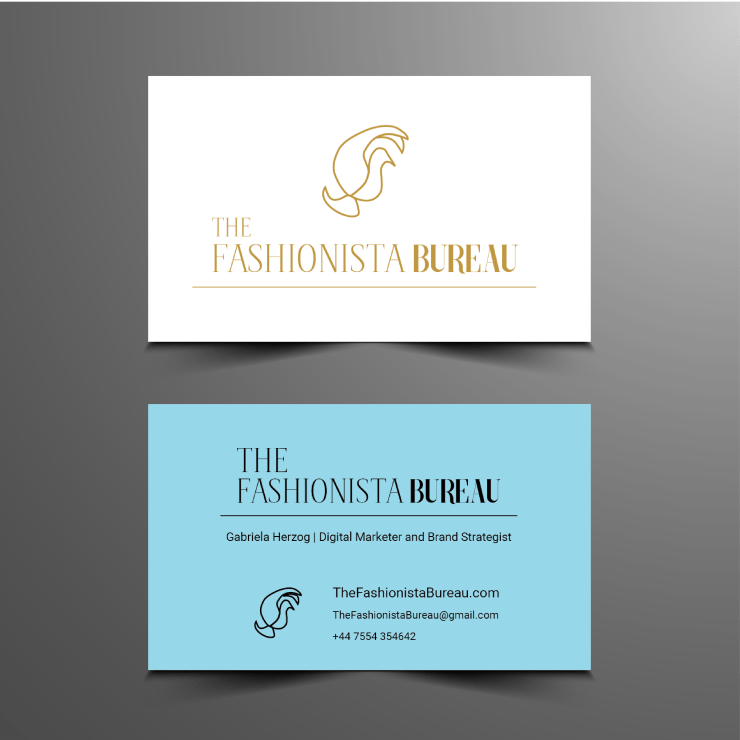
The Visual Identity
The logo presents a minimalist lettering in gold or black colour to give an air of elegance. The symbol of bird, in contrast with white or blue-sky backgrounds, represents the idea of purity, “giving wings to imagination.”
The symbol was designed by hand to represent how the The Fashionista Bureau brand appreciate attention to details and special touch to deliver authenticity.
I hope that you enjoyed reading about me personal brand and please let me know your thoughts about it.
